Project Overview:
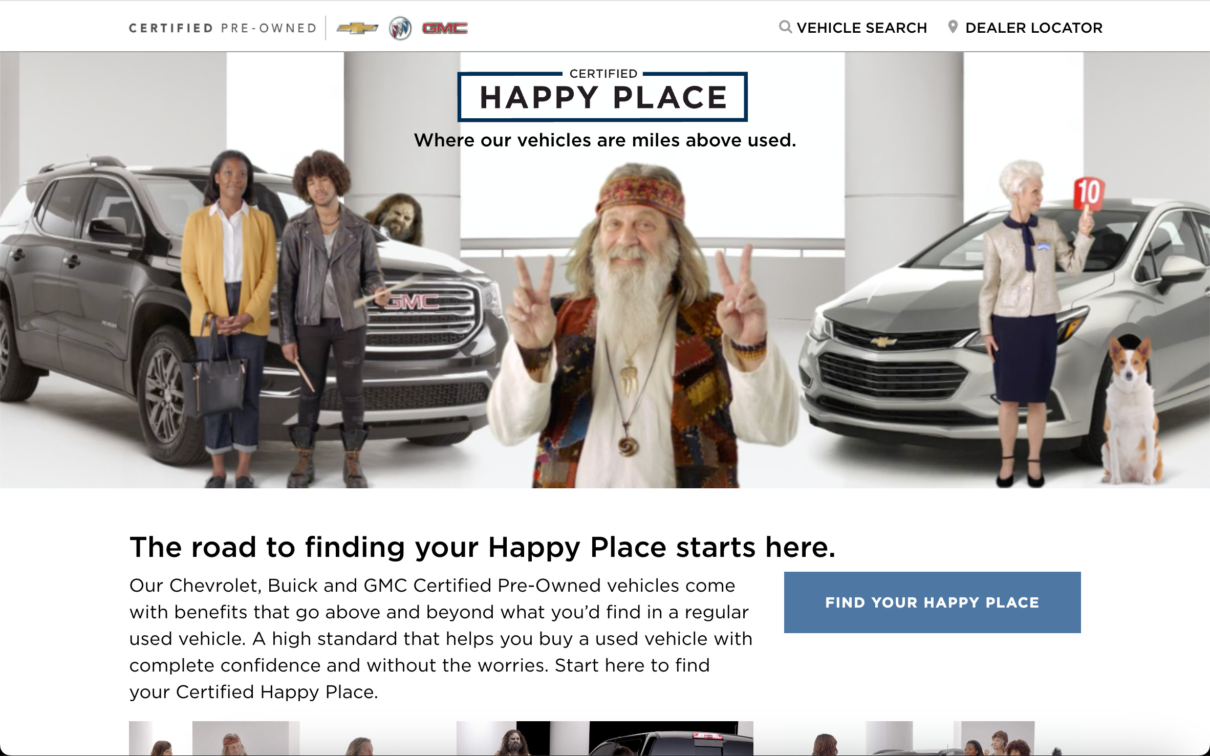
The “GM Certified Happy Place” was an innovative digital campaign designed to transform the way people perceive the used car buying experience. The concept was centered around creating a lighthearted, stress-free environment where customers could explore the benefits of GM Certified Pre-Owned vehicles. The campaign included short videos, social media posts, online digital advertising (OLA), and a dedicated landing page, all crafted to take drivers to their “Certified Happy Place“.
The project aimed to break through the clutter of the automotive market by offering a refreshing narrative. A series of humorous characters—a monster, a hippie, and a king—were featured visiting a used car dealership. Instead of facing the usual hassle, they found themselves in a “Certified Happy Place,” guided by a cheerful saleswoman who highlighted the advantages of GM Certified Pre-Owned vehicles.
My Role:
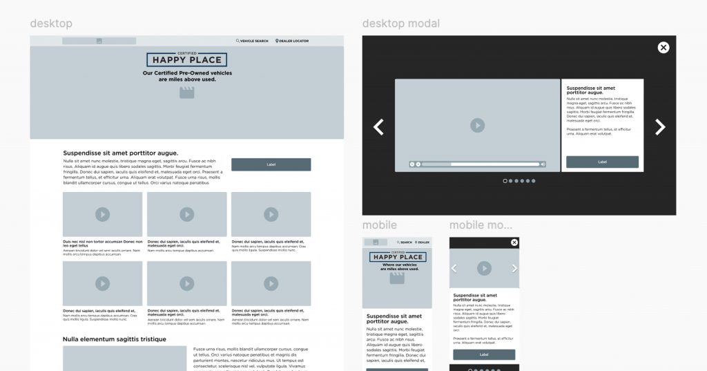
As the lead UX designer and developer, I was tasked with creating the website that served as the digital hub for this campaign. I began by developing wireframes and prototypes that captured the playful yet informative tone of the campaign. The design needed to align with the campaign’s overarching theme while ensuring a smooth and engaging user experience.
Using the Bootstrap framework, I developed the site with a focus on ease of navigation and visual appeal. The site’s layout was designed to be intuitive, guiding users through the features of GM Certified Pre-Owned vehicles in a way that was both informative and entertaining. I also ensured that the site was optimized for performance, delivering a seamless experience across various devices and browsers.
In addition to the website, I was involved in the broader digital advertising efforts, ensuring that the messaging and visuals were consistent across all touchpoints. The goal was to create a cohesive digital experience that would resonate with potential buyers and drive them to explore GM’s Certified Pre-Owned program further.
Challenges and Outcomes:
Despite the creativity and effort put into the “GM Certified Happy Place” campaign, the project was ultimately cut short due to a misalignment with the brand’s messaging strategy. Although the website and digital campaign were fully developed and ready for launch, the decision was made to discontinue the campaign before it could reach a wider audience.
However, the project served as a valuable learning experience in terms of both UX design and brand alignment. The process of creating a playful, user-friendly digital space that still conveyed essential information was a challenge that pushed my design and development skills. The work completed for this project showcased the potential for innovative, emotionally resonant digital campaigns in the automotive industry, even if this particular initiative did not move forward as planned.
Conclusion:
The “GM Certified Happy Place” project may not have reached its intended audience, but it stands as a testament to the power of creative digital design in transforming traditional customer experiences. The landing page and digital campaign we developed demonstrated how thoughtful UX and engaging content can work together to reimagine the car-buying journey.


